From letter shapes to visual culture: Keith Tam
I met Keith Tam during my first year in Hong Kong, at an one-day symposium on multilingual typography organised by Tam and Design2Context, a research institute at the Zurich University of the Arts and led by Prof. Dr. Ruedi Baur. I had been invited to speak. Ever since then, he has been the person in Hong Kong who continuously created occasions and platforms to bring local and international typographers and designers together: whether for large-scale conferences such as AtypI Hong Kong in 2012 or talks and presentations at the Hong Kong Polytechnic University (HKPU), where he taught. Although I have been on the faculty of the Academy of Visual Arts of Hong Kong Baptist University, we still became colleagues and friends. At my institution, I am the only teacher who covers typography, book design and information design, so it has been important to have exchanges with people like Tam, who work in the same field.
Hong Kong born yet Canadian- and UK-educated, Tam has a unique perspective on the identity of Hong Kong typography. He went to England together with his family when he was 13, and from there, moved on to Canada, where he studied at Emily Carr. During his Bachelor’s Degree programme in Communication Design, he taught himself design theory and history, reading typography and information design journals. This led him to Reading University, where he completed his Master’s Degree in typeface design. After several years of teaching at Emily Carr, he moved back to Hong Kong, where he has taught, researched and designed at the HKPU School of Design until recently.
Moving back and forth between Western and Asian culture, Tam is familiar with the Western perception of Hong Kong. At the same time, he knows and remembers the Hong Kong of the 1980s. He grew up in Kowloon City, a neighbourhood which in those days was full of small family-owned shops and workshops. Maybe this led him to research the area’s visual identity: he returned to Kowloon City as a designer.
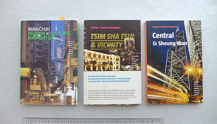
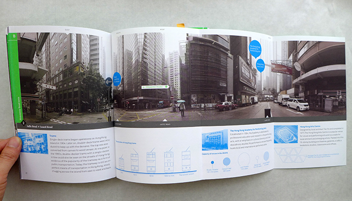
To me, the projects where Tam connects research with practice-based visualisation – in order to communicate the local culture – are the most interesting. Within the context of the information design lab at HKPU, he has published three pocket-sized guide books for Hong Kong, each on a specific neighbourhood: Wanchai (2010), Tsim Sha Tsui & Vicinity (2011) and Central & Sheung Wan (2012). As the secondary titles say, these three books are design and culture navigators, including for instance, local specialties that are often missed in general guidebooks. They show a subtle variety in design execution regarding typography, layout, graphics, colour scheme, paper choice and finishing, as the support team members of staff and students changed during the three years under his direction.
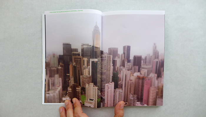
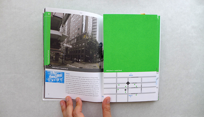
My personal favourite among the three is the first book, about Wanchai. The photographs are in the style of snapshots. Each chapter is designated to a district, with a fold-out page showing side stories and information. One of these sections shows the evolution of the trams regarding their design and size, from 1904 to the latest version as an outline illustration. I may call these pages infotainment and at the same time they demonstrate his passion for this project. The books are an outcome of complex work, starting with the concept, the collection of information in the form of visuals and text, and then the book design.
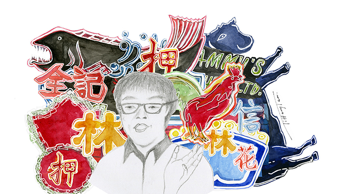
Another Tam project comes to my mind, again related to introducing the city’s visual culture and typography, or lettering: the Neon-sign Bus Tour. Renting an open-topped double-decker bus, Tam personally guided people through the city night, with its glowing characters and signs. The tour was not just a type of tourist attraction, but was strongly connected to his research on neon signs and store signs in Hong Kong. Through talks at conferences and publication of research papers, he archived, analysed and categorised signs according to positioning at the building, size, and style. He also researched Beiwei, a traditional style of calligraphy applied as a reference for the lettering of shop signs in Hong Kong – this was used for small shops owned and run as small family businesses.
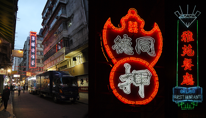
Hong Kong neon signs. Photography by Keith Tam
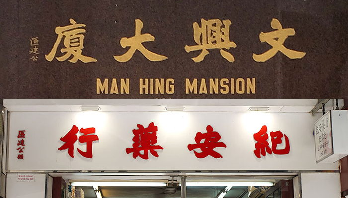
Two shop signs using the style of Beiwei. Photography by Keith Tam.
These projects show Tam’s passion to introduce the visual culture of Hong Kong – with a strong linkage to lettering and typography, if not calligraphy – to an international audience. I was wondering where this interest, if not affection, came from. At the end of June 2015, a few days before he left Hong Kong to start his position as the programme leader of the MA in Information Design at Reading University, I had a conversation with him in Hung Hom. I wanted to know who introduced the shapes of characters and letters to him – who sowed the seeds of fascination in typography.
Tam named three sources of inspiration: all of them are family members. From his parents, who were concerned about his handwriting, he learned “how important the look of words can be”. His father was a graphic and fabric designer. His grandfather, who was an accountant, introduced him to calligraphy. His uncle, who was a letterer specialising in poster lettering, told him about the different styles of lettering.
All the male figures in his family seemed to have a profession related to writing, lettering, or typography and they were eager to teach him as a young child. Keith learned well: when he was 14 or 15, Tam won first prize in a national calligraphy competition in England.
His favourite book during his childhood was a graphic design reference book of his father. The cover showed an apple and was therefore called the “apple book”. Often the working tools of the family – calligraphy pen and brushes, Letraset and typewriter – became his toys. He was allowed to play with anything, yet had one condition: he would be given a professional introduction on how to use it properly.
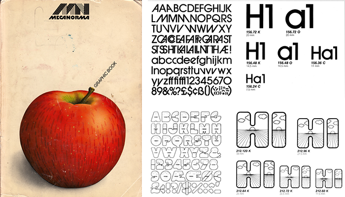
The “apple book”: meccanoma. Title and two spreads (type specimen).
The connection between the function of a tool and the know-how about creating shapes with it was thus playfully introduced to him at a very early stage in his life. This may have led to his analytical mind that I would like to compare with the mindset of an engineer. When Tam works with a tool for the very first time, he asks “how it works, what it is for, where are the limitations of the tool and how does it create shapes”. However, his interest in lettering and calligraphy is not purely a technical one. Towards the end of our conversation, he said that what he enjoys most of all is to create letter and character shapes by hand.
And so the circle is complete. Tam spent his first decade of life in Hong Kong surrounded by a family who was passionate in the craft of writing, lettering and typography; and he was visually socialised by a cityscape of hand lettered shop signs and ones illuminated with neon. Now he uses his skills to capture and communicate a traditional culture that is in danger to disappear.
To know more about Keith Tam: