#1. 2nd day: A Challenge is a Chance – writing Hangul
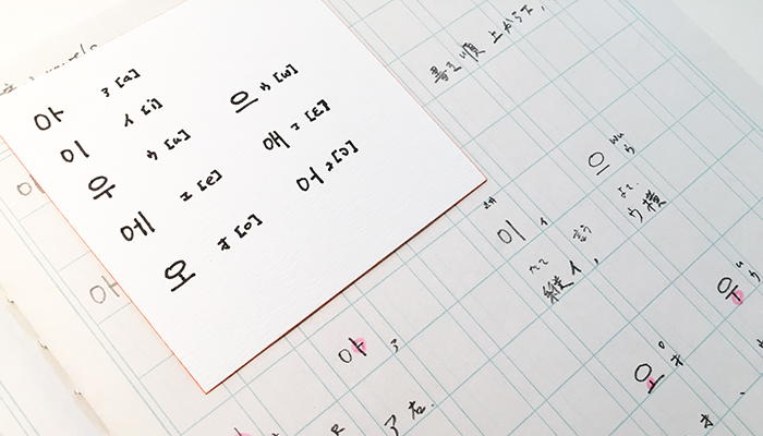
The writing exercise.
The chapter of today taught me the vowels of Hangul. After the light and smooth introduction yesterday, this chapter became more serious. The author of my study book provides didactic visuals to help her readers to understand the system. Yesterday I wanted to know the rules for the order of strokes, today I got it: from top to bottom and from left to right.
From my very shallow previous knowledge, I remember that Hangul characters visualise the shape of the mouth pronouncing the phonetic. This was also part of the lessen today. However I found some of the images too similar.
And I struggled to memorise the shapes of the 8 vowels. I like the indicator 0 positioned at the left or top of a character to mark a vowel. This is really simple and helpful!
Still the vowels themselves are so abstract – they only consist of one to three vertical or/and horizontal strokes.
I need to find my personal “Eselsbrücke” (bridge for the donkey).
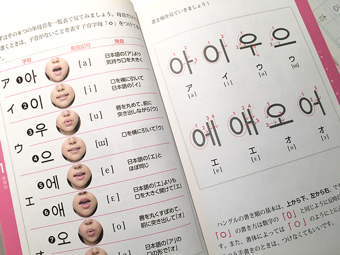
Mouth shape while pronouncing the vowel. Somehow it all looks similar… Only to me?
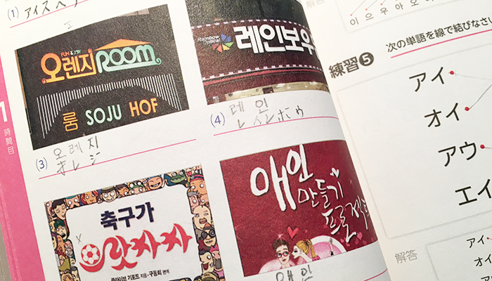
Good experience for a typographer. For the Hangul beginner (me) the very decorative interpretation of characters are a nightmare (bottom left). The second character looks like a man with a moustache.
Those information graphics are so valuable to me! Love this.
Reading of the day.
For todays reading I chose a text by King Ross, as on the first glance looking at the images, I hoped to learn more about the connection between phonetic and shape of the characters. Instead of Hangul Ross writes “Hankul” based on the Yale romanisation, but I will stick to Hangul.
Similar to Coulmas, King praises the writing system as an achievement of a scientific, elaborate phonological analysis.
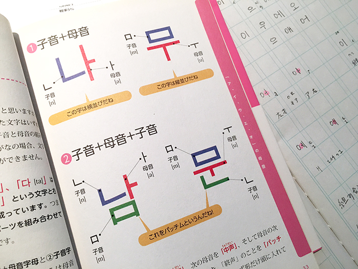
Referring to Insup Taylor, King calls Hangul a system of “alphabetic syllabary” as the smallest elements (I may call it radical) can be compared with alphabetic letters. These Korean alphabetic signs are composed in a “syllable block” to be read as syllables.
The theory connects nicely to the practice that I have done few minutes ago, as King also explains the idea of vowels. In Hangul characters each syllable begins with a consonant, therefore each character consists of at least two elements: a consonant and a vowel. This leads to the consequents that the 8 vowels (according to Yale system: a, i, u, wu, ey, ay, o, e) need an indicator. The sign 0 (standing on the left side it is elongated, at the top it is flat) serves this function. King presents the alikeness of this mark to the figure 0 not as a lucky incident but the statements “there is NO (zero)” consonant. {Is that true or just a nice story?}
Tthe importance of the idea that the characters are capable to instruct people of the correct pronunciations, is mentioned in this text. This perfectly seems to make sense, regarding the original name – The correct sounds for instructing people 訓民正音 – of the royal rescript King Sejong issued in 1446. Just the supporting image, provided by King (referring to Kim Jin-pyong, 1983), could be better and I hope to find better examples in the coming days.
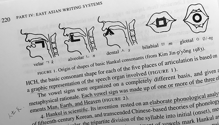
This image in King’s text made me interested and I chose his writing for today’s reading. But this is just an appetiser. Hope to find more. Are there somewhere graphics to all 24 characters?
Another visual made me curious. According to King the shapes of the “alphabetic radicals” were inspired by the three elements: Man, Earth and Heaven. (King 1996, 220) {Again, the visual does not convince me.} I remember that I read something similar yesterday. Coulmas mentioned the philosophical idea behind the characters to graphically capture the idea of the cardinal directions: North, South, East, West, Middle and the five elements: water, fire, wood, metal and clay. This connecting line to graphic ideas is something I would explore more in the coming days.
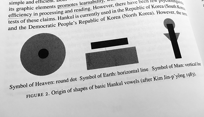
The second interesting image. However, I would guess that if there is a connection to those pictorial ideas, wouldn’t they refer to Chinese characters? Also the round dot named “heaven” rather communicates me the meaning “middle”.
Reference:
King, Ross: Korean Writing. In: Daniels, Peter T. & Bright William (Ed.): The world’s writing systems. Oxford University Press, 1996. 218–227.